↓ Download the Zine — see video on the bottom of this page for ASMR-style folding instructions
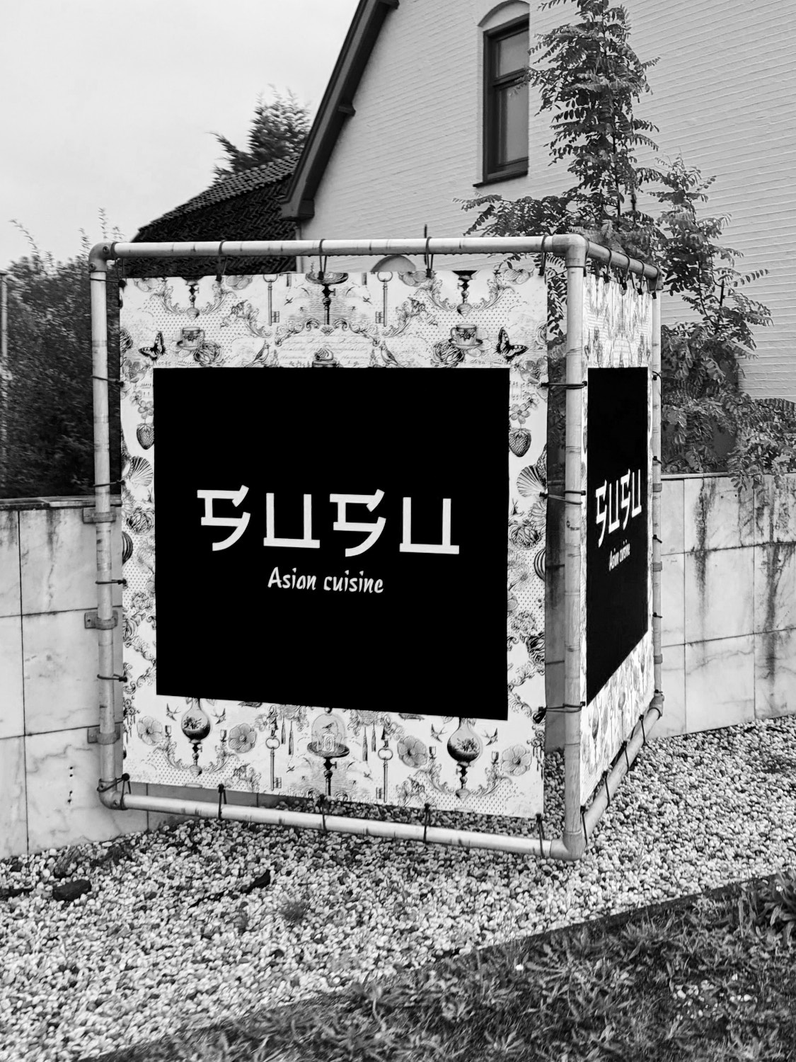
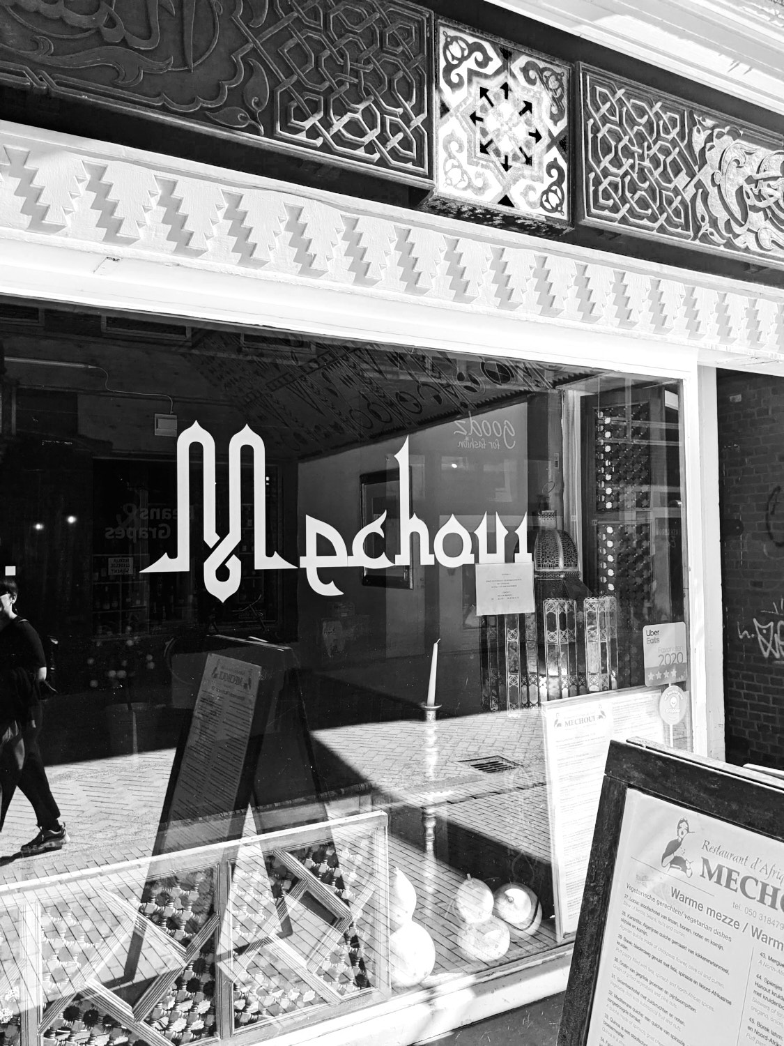
July 17, 2020 • Quarantining I had a lot of time to finally read some books that had been waiting for me in my bookcase. Among them was Bi–Scriptual, a book about “Typography and Graphic Design with Multiple Script Systems“. As I learned about the Arabic, Cyrillic, Greek, Hangul and other scripts foreign to me, I started noticing fonts in use in my direct urban environment that were Latin but re-enacted for example the calligraphy found in Chinese Hanzi lettering. As I am becoming more aware of neo-colonialism, I started wondering whether this could be seen as Typographical Appropriation. I researched where these typefaces came from and ended up on DaFont where I found out that they have a collection of over 600 fonts which they classify as “Foreign-looking”. Diving deeper, I found out that these typefaces were primarily made by designers from the U.S. or Europe. To me, this seemed like typographic blackface, typographical appropriation: the dominant hegemonic script – Latin – taking ownership of the visual features of an oppressed minority script. The only script benefiting of this exploitation is the dominant script, at the expense of the minority script.
With DaFont unfortunately being the source for many beginning designers (my younger self included + it’s number 4 of the most-used distributors in the 2019 Fonts Purchasing Habits Survey), I wanted to educate others about this phenomenon and hopefully help prevent it, so I did what designers do when they want to tell other designers something and made a zine. My goal is to educate Western designers about their privileged position when designing with the Latin alphabet, learn about the neglect and oppression that the Arabic script faced and faces, and to raise awareness to bring an end to typographical appropriation. For my research I chose Arabic, as this is a script I know most (but still far too little) about, after Latin. It is also a script with a large user base and one that differs very much from Latin from a technical perspective, which eases the highlighting of the dissimilarities. There is also a large Arabic speaking community in The Netherlands and I am confronted with Arabic texts on a daily basis.
Sources & Resources
Article • 1So, Guthenberg Didn't Actually Invent The Printing Press, by M. Sophia Newman
Article • Modernizing Arabic Type for a Digital Audience, by Google Fonts
Article • 7Multiscriptual Typesetting, by Beatriz Lozano
Article • 3Technology has (mostly) figured out Arabic — now it just needs new fonts, by WIRED
Article • Google and Monotype collaborate on font that spans all written language, by Dezeen
Article • 5How Fonts Are Fueling the Culture Wars, by WIRED
Article • Karate, Wonton, Chow Fun: The end of ‘chop suey’ fonts, by CNN
Article • What if Arabs Had Invented the Printing Press? by Soulaf Khalifeh
Article • It's Time To Act (2. We need to stop using the term Non-Latin), by Alphabettes
Articles • History of Hanzi, by Julius Hui at Dalton Maag
Essay • New Black Face: Neuland and Lithos as Stereotypography, by Letterspace (Journal of the Type Directors Club)
Magazine • Slanted #32—Dubai
Magazine Article • Reputations, Eye no. 94
Book • 2, 4Bi–Scriptual by Ben Wittner, Sascha Thoma, Timm Hartmann, published by Niggli
Book • Arabic for Designers by Mourad Boutros, published by Thames & Hudson
List • Non-latin-type-designers by Ivo Gabrowitsch
Podcast • The Wubi Effect — Challenges of fitting the Chinese language to the Western-centric keyboard, by WNYC Studios | Radiolab
Report • 6Typographic Matchmaking 01 — Building cultural bridges with typeface design, by the Khatt Foundation
Movie • Typographic Matchmaking 02, by the Khatt Foundation
Panel • Arabic Type: Technology & Heritage: Mamoun Sakkal, Stephen Coles, Nadine Chahine, Erich Scheichelbauer
Foundation • Granshan — Conference, Festival and Competition for recognizing excellence in ‘non-Latin’ type design
Conference Report • Script, print, and letterforms in global contexts: the visual and the material, by Hanna Donker
Tool • Is This Arabic, by Rami Ismail
Stop Typographical Appropriation
The printing press was invented in Korea by Choe Yun-ui, a full 150 years before Gutenberg was even born.1 Gutenberg’s press however spread from Europe to the Middle-East, but this printing press was designed for the Latin script. The evolution from written to printed type was not smooth for Arabic. Starting in the 16th century and continuing for the next 200 years, Arabic fonts were made exclusively by Europeans and used for faith-based propaganda to convert Muslims to Christianity or for scholarly work addressed to a Western audience. This printing activity actively coincided with a great cultural, political and economic decline in Islamic empires.2
Today there is still a lack of high-quality Arabic fonts, whereas there is an abundance of Latin typefaces available.3 From both moveable to digital type, Arabic saw waves of simplification that significantly changed the script in comparison to its source.4 Arabic letterforms sacrificed their sophistication to fit the European technology instead of the European technology developing further to work for the Arabic script.5 Due to a lack of unified technical standards that are universally shared by different technology suppliers,6 simple things Latin users take for granted, like copy-pasting, can break an Arabic text and result in it becoming illegible.7
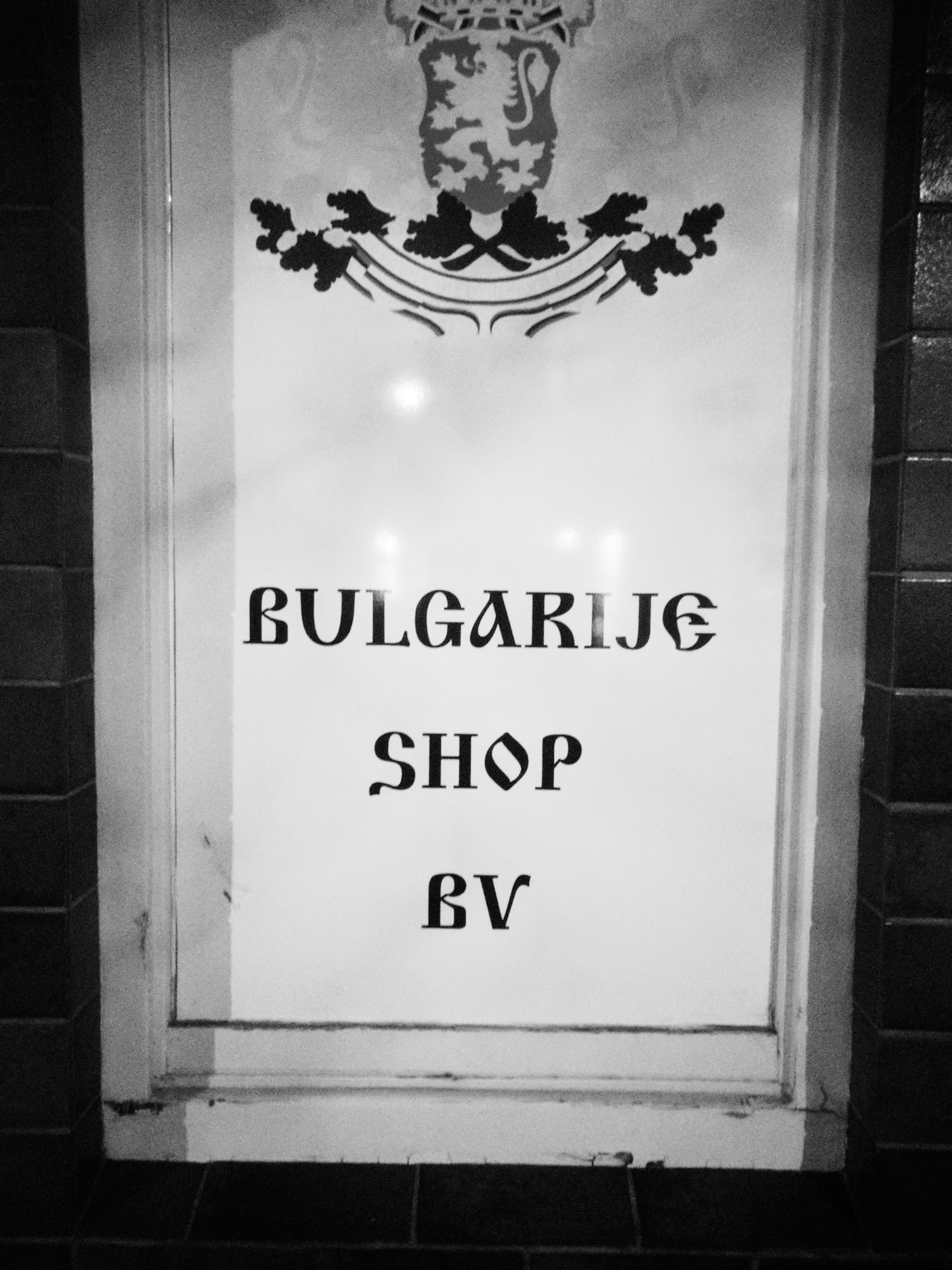
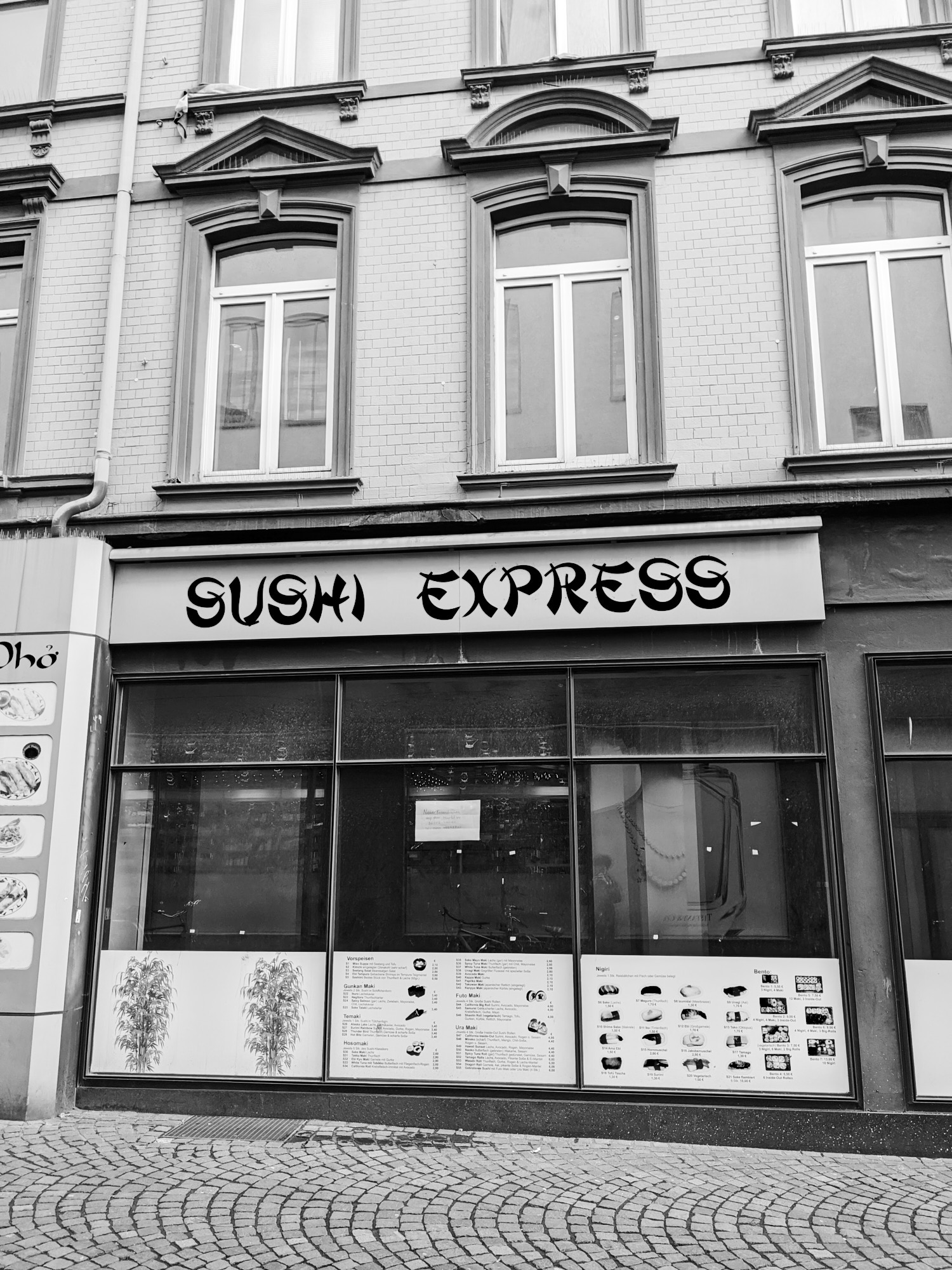
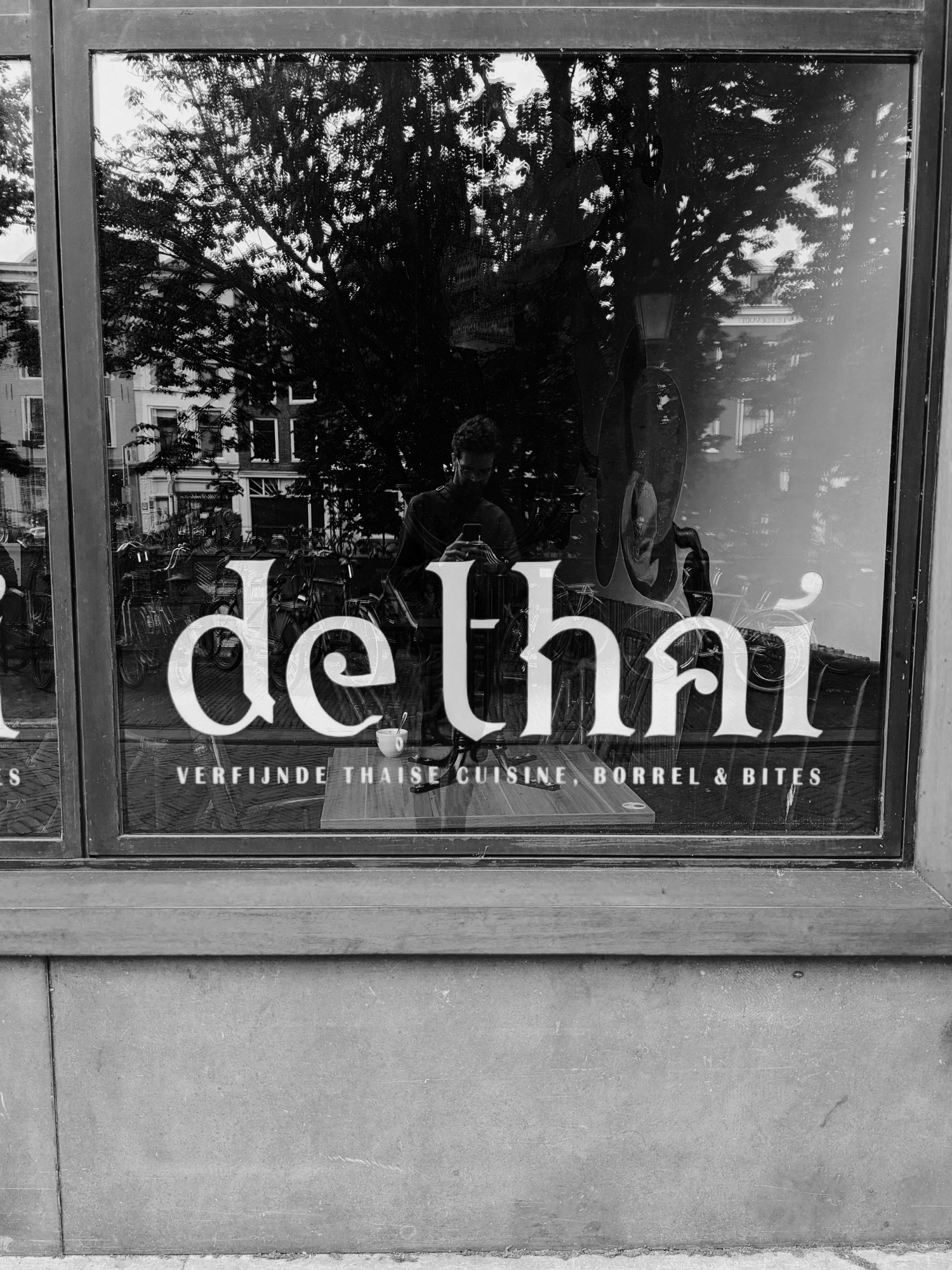
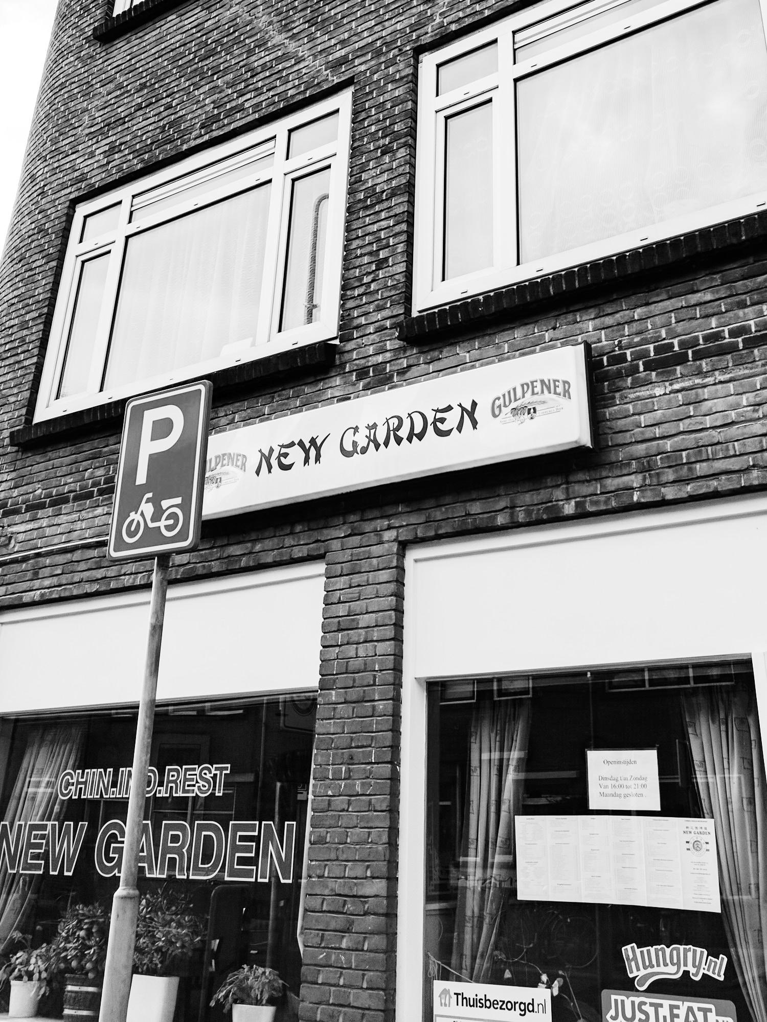
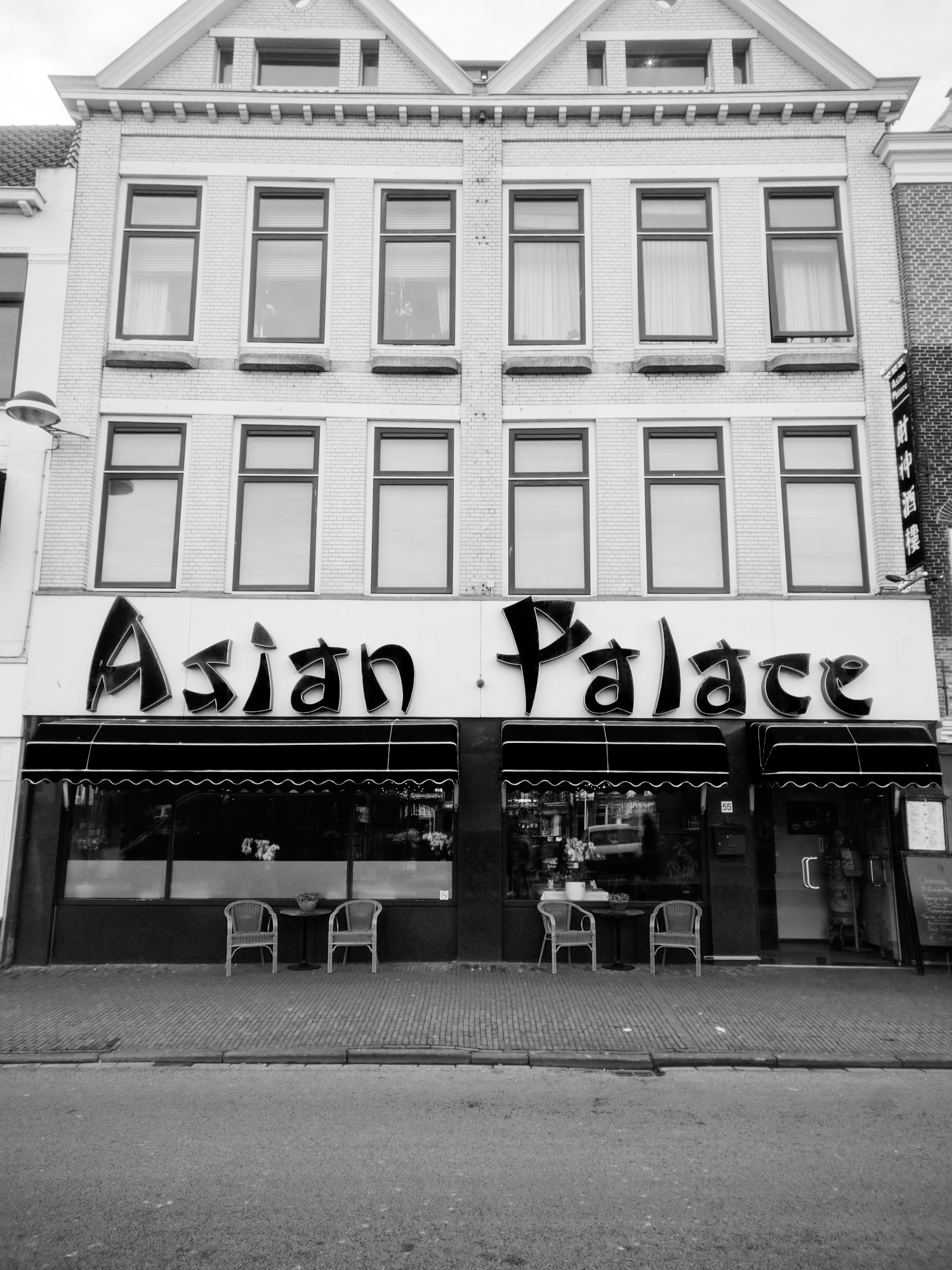
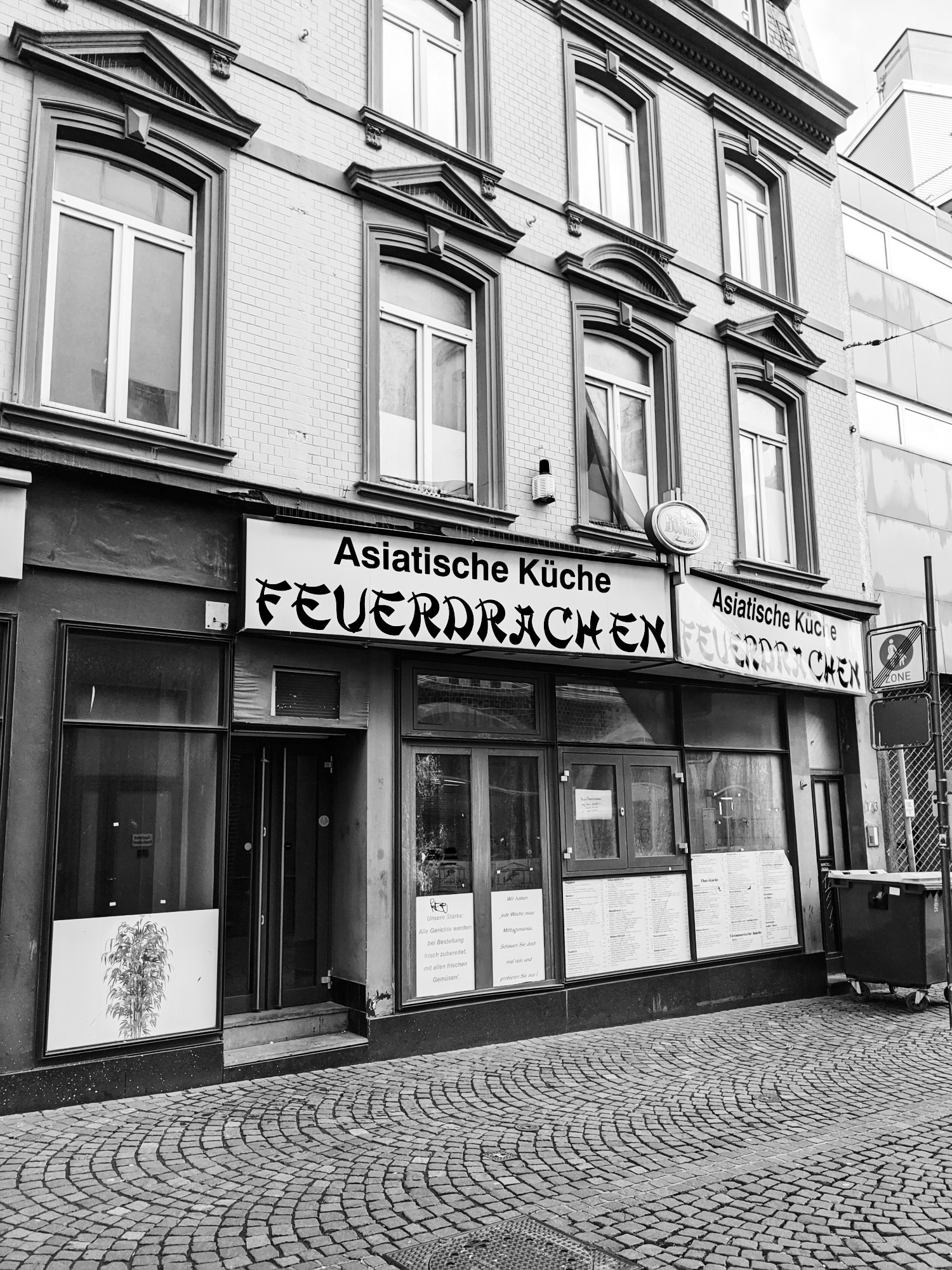
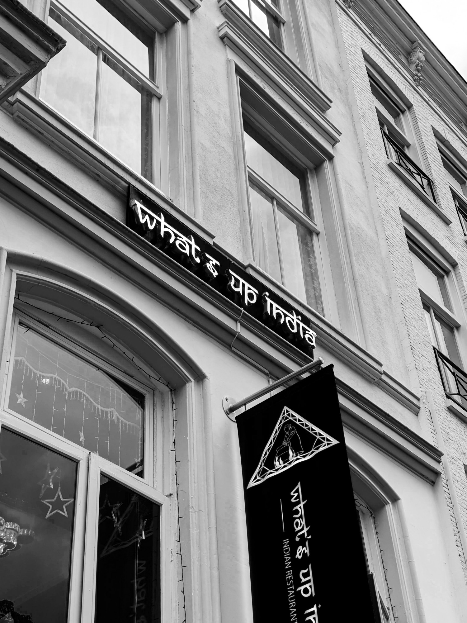
In this zine I am focussing on Arabic, but the points made here are valid for many scripts (as can be seen in the photographs) which have been oppressed and neglected in research and design for too many years. It is problematic to dress up Latin type to make it look like a marginalized script, as it is like blackface or drag queens; the dominant hegemony dressing up as the oppressed minority. When asked to make something look more ‘exotic’, question whether the origins of your client justify it to propagate a certain typographic culture, and whether you’re the person with the right background to design this. Do not use an appropriating font, you’re a better designer than that.
Where to buy
This zine is not for sale. Europeans have wrongly profited of Arabic type for too long, which is why I chose to share this zine free of charge with anyone near Utrecht (just shoot me a DM at @discokerning on Instagram), or as a digital download to anyone online. Below you will find instructions on how to fold and cut the zine. All you need is a piece of (preferably FSC-certified) DIN A4 sized-paper, a printer, two hands with fingernails and a pair of scissors. Consider printing a few extra and distributing the zine for free among designers in your circle.
If you have money burning a hole in your pocket, consider buying a font from a (independent) foundry that prioritises the development of multi-script fonts or fonts for marginalised scripts. For Arabic, 29LT, ArabicType and TPTQ Arabic come to mind. Other sources to find foundries could be the Type Foundries Archive or this list of Black type designers and foundry owners.
Folding Instructions
Do you have any feedback or questions about this project? Please do get in touch. This is not the final destination in my journey of becoming aware of my privileges, it is merely me lifting my heel up to take a first step, sharing my findings along the way, hoping to create a map for others to help them walk the right route. Additional sources or information about European influence or hindrance of the development of the Arabic script would be very welcome too.
©️ Bart Leguijt —
Hamburgefonstiv ->